L
A
B
Iconography is key
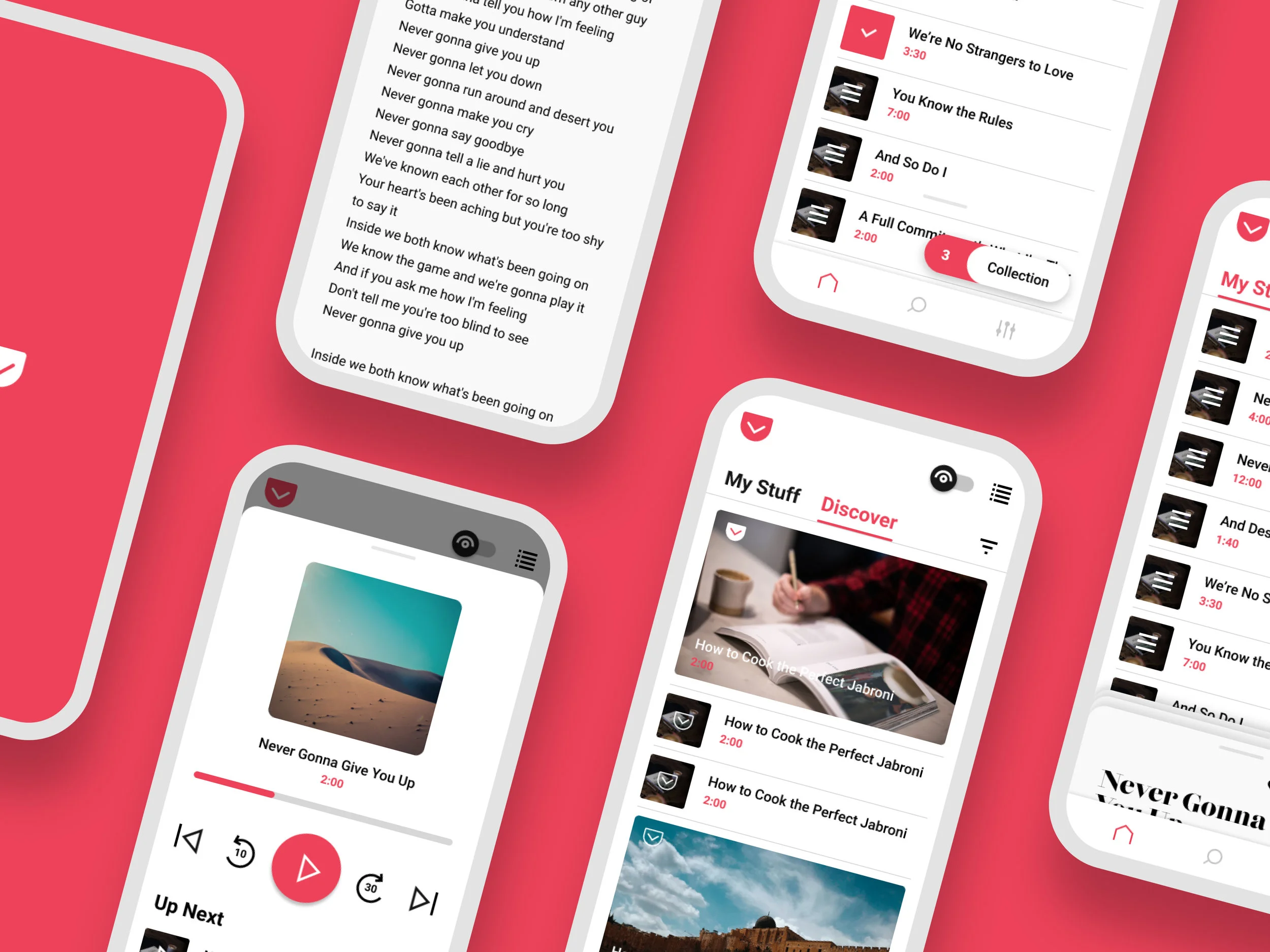
A key change is updating the listening and reading mode iconography. Connecting the ear and the eye visually reinforces that they are different sides of the same coin.
Brand New
By simplifying the color palette, users can focus on the content. Especially with Pocket, so many colors are presented from scraping content. This means going with a starker palette, especially for action items.
Pocket’s former product design language was overwhelmed by content and high-priority functionality. The new design language makes this experience feel uniquely Pocket while making reading and listening a delight.


